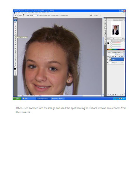
I was asked to conduct invterview research on the band that will be using in my music magazine:
Was you in a band before Caroline 199 ?
Why did your pervious band end ?
What age was you when you was in your first band ?
Were did you play?
Did you tour?
How did your new band start?
When did your new band start?
What things have your band done?
Have you toured in your new band?
What are your band currently doing?
What do you see happening for yourself in the next 6 months?
Thursday, 18 November 2010
Article Resreach
In this lesson i was asked to conduct article research this is shown below:
In the spring of 2007 Caroline 199 was born. The band is made up of three people who shared a passion for 60s music and particularly Pirate Radio. Pretty soon the band began appearing at the world famous Cavern Club in Liverpool and have now become one of the featured resident acts appearing over 80 times to date.
As time progressed the lads wanted to bring Pirate Radio to the public and created the concept of performing a live radio broadcast. This was to be presented with the original jingles, adverts and the DJ parts played by the members of the band. As an addition to the show and due to the complexities of the 60s arrangements, the lads drafted in one of the best and well known keyboard players in the county, Tony Cook.
The band contacted Trevor Dann from the Radio Academy after attending an offshore radio convention in London. At the convention, the band were astounded at the multi-media presentations that were shown on the day, and so asked Trevor if he knew who organised the event. Trevor put us in touch with two of the most amazing people we have ever met... Chris and Mary Payne from Radio London.
We have developed a strong friendship with Chris and Mary and as a result we have collectively put together the most unique 60s show around.
The multi-media narration is by one of the original DJ’s Mr Roger ‘Twiggy’ Day and produced by Chris & Mary Payne giving the viewer the information of how the fashion, music, and culture of the 60s would not have been here today without BIG L and RADIO CAROLINE.
You can enjoy a Pirate Radio broadcast live in 3D, so jump aboard and see and hear the CAROLINE 199 SHOW..... It's great to have you along.
Wednesday, 17 November 2010
Rough sketch
In this lesson I was asked to design my rough sketches of my music magazine these are as shown below:
Front cover:
contents page:
Front cover:
contents page:
Planning production
In this lesson I was asked to design my planning production this is to show what will be in my magazine.
These are the cover lines that will be on the for my of my music magazine
Cover lines:
Music special of the year !-kings of Leon
Bruno Mars-behind the scenes
Plain White T's-hitting the U.S
How i made it back here again though my ups and downs- Lead singer of Caroline 911
Puff line
Free Biffy poster
This is the text that will be on my contents page of my music magazine
Regular content:
P1-Editor letter -Hey guy’s ,
Thanks for getting this month’s issue of ‘Indie’. Here at ‘Indie’ we will give you an all music full packed music magazine. If your love for music is as big as ours then you’ll love ‘indie’.
Thanks guys
Thanks guys
P2-3-Gig dates
P 4-6-Gig reviews
P7-9-Gig’s of the month
P10-12-Albums of the month
P13-14-Musical services
P15- Music quiz
P16-18-Tour dates
P19-22-Tour reviews
P23-24-Album reviews
P25-26-News
Feature content:
P26-28-Interview- Caroline 911
P29-32-Kings of Leon special – Their highlights of the year
P33-35-Icons of the month- As voted by you
P36-Fan wall- A chance for you as the fan to tell us what you think
P37-39-Meet the people behind ‘Indie’ magazine
P40-43- Come behind the scenes of Bruno Mars tour
P44-46- Free Biffy Clyro posters
P47-48-Music and Me- Elbow
P49-50-The Kooks-Come back of the year
P51-52-Plain white T’s- Hitting the U.S
P53-55- I love gig’s- an insight into kids in glass houses life
P56-57- I can’t read music – drummer of Razorlight
P58-60- Music inspired me to get off drugs-Dave McCabe from The Zutons
P61-63- James Skelly- I feel in love with music-
P61-63- James Skelly- I feel in love with music-
P64-65- Are first ever tour !- Airhead
Below are listed the images that i will need are as follows-
My main image on the front on my music magazine will be the image of the band I have interviewed. The next image i will be using will be a small picture of my editor to show the readers who the editor is.
The article i will be writing will for my double page spread will be about the highs and low's Ian has been thought. I will also be talking about his old band and how he made it to the top, then how his band split up and how he over come that.
The images I will be using will be a main image of the band or artist playing. This will be in a medium long shot.
Tuesday, 16 November 2010
Publication Plan
In this lesson i was asked to design a publication plan for my music magazine. This is shown below:
Title: Indie
Positioning statement: For the love of Indie music in you
Frequency of publication: monthly
Frequency of publication: monthly
Price:£2.50
Distribution: Newsagents and Supermarkets
Rationale: The approach of the magazine is for music lovers. I will offer opinions and insights in to music articles and inviterviews, the latest gig’s and gig reviews. It will be packed full of nothing but music talk.
Style: Informal using humour and language that 15 – 30 year olds will understand. Short paragraphs and slang will also be used.
Images will be the dominant feature of layout.
Regular content:
· Editor letter
· Gig dates
· Gig reviews
· Gig’s of the month
· Albums of the month
· Musical services
· Music quiz
· Tour dates
· Tour reviews
· Album reviews
· News
Feature content:
- Interview- Caroline 911
- Kings of Leon special – Their highlights of the year
- Icons of the month- As voted by you
- Fan wall- A chance for you as the fan to tell us what you think
- Meet the people behind ‘Indie’ magazine
- Come behind the scenes of Bruno Mars tour
- Free Biffy Clyro posters
- Music and Me- Elbow
- Come back of the year - The Kooks
- Hitting the U.S – Plain white T’s
- I love gig’s- an insight into kids in glass houses life
- I can’t read music – drummer of razorlight
- Music inspiyed me to get off drungs-Dave McCabe from The Zutons
- I feel in love with music- James Skelly from The coral
- Are first ever tour !- Airhead
House style:
Cover lines: bell gothic STD black; 20
Headlines: Constantia; 15
Stand lines: Franklin Gothic Demi; 11
Captions: Frankiln Gothic Demi; 11
News first paragraphs: first word in bold
Body text: time’s new roman 11 pt
Colour scheme: white, red and black
Saturday, 6 November 2010
Results
In this lesson i was asked to do a slideshow to show the results of my questionnaire. I then uploaded it into slideshare. Please click on the link below :
Presentation1
View more presentations from brunt
Thursday, 4 November 2010
Questionnaire
In this lesson i was asked to produce a questionnaire. This was to help me design my music magazine. This is shown below.
Wednesday, 20 October 2010
Analysis of a professional contents page
In this lesson i was asked to use a site called prezi to design a presentation to show an analysis of a professional contents page; To view this please click on the link below.
http://prezi.com/vtxeifq8egcf/copy-of-analysis-of-professional-contents-pages/
http://prezi.com/vtxeifq8egcf/copy-of-analysis-of-professional-contents-pages/
Thursday, 14 October 2010
Wednesday, 13 October 2010
Intial plans for my magazine
For this lesson i was asked to use my research and make a decision about my magazine. This is as follows:
- Price- The prize for magazine will be £2.50.
- Frequency of publication- My magazine Will be published monthly.
- Average issue size- It will be 50 pages long.
- Regular contents- Gig dates, Gig reviews, Poll and new songs that are out.
- Feature articles - Different interviews with bands.
Tuesday, 12 October 2010
Codes and conventions of a double page spread
In this lesson i was asked to list the codes and conventions of a double page spread these are as follows;
- Text- The text is in size 11. It is in Aerial. This is because there is a lot of text to fit on the page.
- Main head line- This is in a bigger and different font by doing this it stands out on the page.
- Name- The artist name is always highlighted.
- Caps- Drop caps are used to make the article look more formal.
- Page number- The page number is listed on the bottom right hand size on the page. This is along with the magazine name and the website address.
- Informally- If the magazine was formal the reader would find it boring. The point of the magazine is to inform the readers but to do this it has to be made entertaining.
- Headlines- These are bold so they stand out. They are short and snappy.
- Credits-These are to thank the photographer and the writer. These are known as the 'Bylines'.
- Columns- The pages are split into 3-4 columns each side.
- Drop quotes- These are big as they stand out. These are normally on the image or the article.
- Image-There is one main image used. The image is on the left hand side, but if the image was to cross over then this would be called bleeding.
- Colour- Simple colours are used normally 3-4 these match the image and run with the main colour theme.
Researching the market place
In this lesson i was asked to research into existing music magazines. I was also asked to focus on magazines of a similar nature of the music magazine that i will be creating. These magazines are shown below:
Magazine name:NME
Price: £2.30.
Magazines publishes website: http://www.ipcmedia.com/

Magaizne name:Q

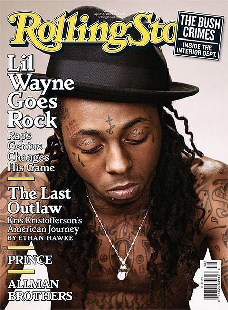
Magazine name: rollingstonePrice:£3.20
Frequency of publication:Monthly
Average issue size:60
Regular content: New releases
Feature articles: special interviews
Magaines Website: http://www.rollingstone.com/
Magazines publishes website: mailto:publicity@rollingstone.com
Magazine name:NME
Price: £2.30.
Frequency of publication:Weekly.
Average issue size:69 pages.
Regular content: Regulars such as 'On repeat' This is a page for songs that have been voted for my the staff of NME.
Feature articles:Interviews with celebrity's.
Magazines Website: http://ww.nme.com/Magazines publishes website: http://www.ipcmedia.com/

Magaizne name:Q
Price:£3.90
Frequency of publication:Monthly
Average issue size: 55
Regular content: New releases
Feature articles: intervies with differnt people
Magaines Website: http://www.qthemusic.co.uk/
Magazines publishes website: http://www.bauermedia.co.uk/

Magazine name: rollingstone
Frequency of publication:Monthly
Average issue size:60
Regular content: New releases
Feature articles: special interviews
Magaines Website: http://www.rollingstone.com/
Magazines publishes website: mailto:publicity@rollingstone.com

Monday, 11 October 2010
Initial ideas for main task
In this lesson i was asked to make a decision about my initial ideas these are as follows:
- My music magazine that i am doing to produce is an indie/rock .
- My target audience is 15 yrs plus or those that like the genre of indie and rock.
Evaluation of magazine
I was asked to evaluate my magazine. My magazine is in the genre of school. I was asked to used a number of programs to make a front cover and a contents page this it to be sold / given out in a school. My magazine uses the codes and conventions in a number of ways. The first is that my 'Mast head' - This is my title it is in a bigger font by doing this my. It is on the top center of the page, be doing this if my magazine was to be on a self then my magazine would be easily seen by the user or customer.
The next similarity is my image. My main image is Central it is on a plain back ground and by doing this it again means that again that the image stands out to the reader. I placed the text around the image but no on the face on the image. The image is a close-up median this looks more formal.
But i did not follow all the codes and conventions such as i did not font 11 i did this because i did not have enough features with in my contents page. Another way I did not follow the codes and conventions was i did not use any smaller images. By doing this i did not clutter my front page.
I used a number of programs such as Adobe Photoshop and quark. I had used Photoshop before therefore i known what I was doing and was able to master how my front page was going to be like. But i had never used quark before therefore i did not really known what to do. Because of this it took me more time to first learn about the programme and how it worked before i could then create my contents page.
Sunday, 10 October 2010
Prodction of school magazine contents page
In this lesson i was asked to use Quark Xpress to create my contents cover. I then also took screenshots to show this. This is shown below ;
Production of school magazine fornt cover
In this lesson i was asked to use Adobe Photoshop to product my magazine front cover, following my rough sketch. I have also taken screen shots as i produced my front cover as shown below ;
Final images for school magazine
In this lesson i was asked to use Adobe Photoshop to produce the final images that i will be using in my school magazine. The screen shoots below so how i have used Photoshop to show tha tools that i have used to manipulat my images ;
Photographs for school magazine
For this lesson i was asked to take my pictures that were to feature in my school magazine .These are as soon below:
Wednesday, 29 September 2010
Plan of my content page
In this lesson i was asked to plan my content page i was asked to plan things such as. A list of regular content which will appear in my magazine. I added ;
The next thing i was asked to plan was a list of 10 feature articles which will appear in my school magazine these are as follows;
I will also be using a picture of the students around school or doing work.
The last image i will use will be if the students from last years prom.
- Editors letter- This welcomes new and old readers to the magazine and lets them know what the magazine is about
- School shop - This is where students can shop online to buy things such as books and pens. There is a girls and a boys selection.
- Student of the week- Each week a different student from each year group is made student of the week. They get this for going good things.
- Teacher of the week - Students voted for who they think the teacher of the week is and why.
- Find out what the students are up to- Tells other students of events that happened etc.
- Best picture of the week- Students take there pictures and send them in then another group of students then decide which is the best.
- Is there something you want..- This this were students can text in and say what they want to see in the magazine.
The next thing i was asked to plan was a list of 10 feature articles which will appear in my school magazine these are as follows;
- Beauty and the Beast cast revealed - students find out the cast of the show.
- Beauty and the Beast behind the scenes- a inside look to how the show runs.
- Beauty and the Beast dates revealed- students are told the dates of the play.
- Beauty and the Beast interview with the costume designer- a behind the look at how the costumes are made.
- Sixth form prom dates revealed.
- What are the teachers up to - This tells the students what the teachers of the school are going to be doing/ or have done.
- Painters week- pictures are a article on painters week by the students.
- New online books- Students can now read a selected of books online for free.
- Meet the people behind 'learning'- Interviews and pictures with the people who make the magazine.
- Interview with the head- A one of interview with the head teacher.
I will also be using a picture of the students around school or doing work.
The last image i will use will be if the students from last years prom.
Plan for my front cover
In this lesson i was asked to the first part i was asked to plan was the title for my magazine. I called it 'Learning ' I did this because the genre of the magazine was school. The mise-en-scene on my front cover consits of ;
- A median close up image on the front cover. On mine i have a school girl smiling.
- I have chosen a white back ground. I had done this so my image and text stand out.
- My title is in a red colour it is bold and in a bigger font so it stands out also.
- My other text is in a black colour.
- I haven't used any props as i just wanted the image alone.
Sunday, 26 September 2010
Codes and conventions of a contents cover
In this lesson i was asked to list the codes and conventions of a magazine contents cover. These are as follows :
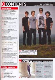
- Colour scheme- this runs though out the magazine. It is three to four colours so therefore it is basic but eye-cacthing.
- Image- There is one main image this anchors with the cover story. Their is normally also ten small images that also anchors with the featured stories. Also the page number is on the image so that the reader knows what they relate to.
- Title- The main title is always called 'content' or 'contents'. It is not always on the left but is in a big font that differs from the other text.
- Layout- The layout is normally in two to three columns. It normally has twenty features or regular articles. It is in font 11. There is also a section for the editors letter.There is also a line gap between each section so it is clearer to the readers.
- Font- The font is in size 11 and the same thought so it is easy on the eye for the reader.
- Editors letter- This is a iintroduction as to what the magazine is about.
- Credits- This thanks the photographer i.e. for the main image on the front cover.
- Contacted details- These are normally things such as website, email, address and phone number. These are normally on the bottom right as they are the least important thing within the contents.
- Date- On the bottom or top of the page.
- Page number- this is to the left before the text and is in a different colour so is easy to see.

Tuesday, 21 September 2010
codes and conventions of a magazine frontcover
In my first two lessons i was asking to write up the codes and conventions of a magazine front cover.
These are as flows :
- Mast Head ; This is overwise known as the title, it is in a unqiue front as it then stands out. If the magazine is well known that sometimes the mat head can sometimes be partly hidden by an image, it then normally has a posing statment above it or below.
- Bar code; This is normally placed at the bottom or the size of the front cover. On the bar code it should have the price so that the customer knowns how much it is, the data so the customer knowns then the magazine was released , then the issuse number so that the customer can see when the magazine was released and therefore if they miss an issue they can then order it thought the issue number. And the last thing on the bar code is the website.
- Buzz words; These advertise to the customer if anything is new or excusive within the magazine.
- Puffs; This advertises to the customer freebies.
- Image; This is the central picture on the magazine, this is normally a close up shot. It is normally on a pain background so the image stands out. Text is normally around the image and never on the face . The picture anchers with the text written as this makes it look formal.
- Cover lines; This are around the image and are in the same font. There is normally five too six cover lines.
- Smaller pictures; These are to show what else is in the magazine .i.e. a new C.D.
- Main cover line; This goes with the main image used on the magazine to cover the maon text.
- Colour scheme; Normally three too four colours are used, by doing this it means that its simple and that the colours do not clash. The colours not only have to be eye cacthing but they also have to be easy on the eye.
- Genre; The genre of the magazine has to be made clear i.e. rock magazine.

Subscribe to:
Comments (Atom)


