In this lesson i was asked to use a site called prezi to design a presentation to show an analysis of a professional contents page; To view this please click on the link below.
http://prezi.com/vtxeifq8egcf/copy-of-analysis-of-professional-contents-pages/
Wednesday, 20 October 2010
Thursday, 14 October 2010
Analysis of professional music front covers part 3
In this lesson i was asked to analysis of professional music front covers this is as shown below:


Analysis of professional music front covers part 2
In this lesson i was asked to analysis of professional music front covers this is as shown below:

Analysis of professional music front covers part 1
In this lesson i was asked to analysis of professional music front covers this is as shown below:


Wednesday, 13 October 2010
Intial plans for my magazine
For this lesson i was asked to use my research and make a decision about my magazine. This is as follows:
- Price- The prize for magazine will be £2.50.
- Frequency of publication- My magazine Will be published monthly.
- Average issue size- It will be 50 pages long.
- Regular contents- Gig dates, Gig reviews, Poll and new songs that are out.
- Feature articles - Different interviews with bands.
Tuesday, 12 October 2010
Codes and conventions of a double page spread
In this lesson i was asked to list the codes and conventions of a double page spread these are as follows;
- Text- The text is in size 11. It is in Aerial. This is because there is a lot of text to fit on the page.
- Main head line- This is in a bigger and different font by doing this it stands out on the page.
- Name- The artist name is always highlighted.
- Caps- Drop caps are used to make the article look more formal.
- Page number- The page number is listed on the bottom right hand size on the page. This is along with the magazine name and the website address.
- Informally- If the magazine was formal the reader would find it boring. The point of the magazine is to inform the readers but to do this it has to be made entertaining.
- Headlines- These are bold so they stand out. They are short and snappy.
- Credits-These are to thank the photographer and the writer. These are known as the 'Bylines'.
- Columns- The pages are split into 3-4 columns each side.
- Drop quotes- These are big as they stand out. These are normally on the image or the article.
- Image-There is one main image used. The image is on the left hand side, but if the image was to cross over then this would be called bleeding.
- Colour- Simple colours are used normally 3-4 these match the image and run with the main colour theme.
Researching the market place
In this lesson i was asked to research into existing music magazines. I was also asked to focus on magazines of a similar nature of the music magazine that i will be creating. These magazines are shown below:
Magazine name:NME
Price: £2.30.
Magazines publishes website: http://www.ipcmedia.com/

Magaizne name:Q

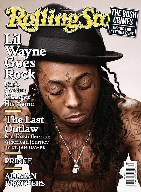
Magazine name: rollingstonePrice:£3.20
Frequency of publication:Monthly
Average issue size:60
Regular content: New releases
Feature articles: special interviews
Magaines Website: http://www.rollingstone.com/
Magazines publishes website: mailto:publicity@rollingstone.com
Magazine name:NME
Price: £2.30.
Frequency of publication:Weekly.
Average issue size:69 pages.
Regular content: Regulars such as 'On repeat' This is a page for songs that have been voted for my the staff of NME.
Feature articles:Interviews with celebrity's.
Magazines Website: http://ww.nme.com/Magazines publishes website: http://www.ipcmedia.com/
Magaizne name:Q
Price:£3.90
Frequency of publication:Monthly
Average issue size: 55
Regular content: New releases
Feature articles: intervies with differnt people
Magaines Website: http://www.qthemusic.co.uk/
Magazines publishes website: http://www.bauermedia.co.uk/
Magazine name: rollingstone
Frequency of publication:Monthly
Average issue size:60
Regular content: New releases
Feature articles: special interviews
Magaines Website: http://www.rollingstone.com/
Magazines publishes website: mailto:publicity@rollingstone.com
Monday, 11 October 2010
Initial ideas for main task
In this lesson i was asked to make a decision about my initial ideas these are as follows:
- My music magazine that i am doing to produce is an indie/rock .
- My target audience is 15 yrs plus or those that like the genre of indie and rock.
Evaluation of magazine
I was asked to evaluate my magazine. My magazine is in the genre of school. I was asked to used a number of programs to make a front cover and a contents page this it to be sold / given out in a school. My magazine uses the codes and conventions in a number of ways. The first is that my 'Mast head' - This is my title it is in a bigger font by doing this my. It is on the top center of the page, be doing this if my magazine was to be on a self then my magazine would be easily seen by the user or customer.
The next similarity is my image. My main image is Central it is on a plain back ground and by doing this it again means that again that the image stands out to the reader. I placed the text around the image but no on the face on the image. The image is a close-up median this looks more formal.
But i did not follow all the codes and conventions such as i did not font 11 i did this because i did not have enough features with in my contents page. Another way I did not follow the codes and conventions was i did not use any smaller images. By doing this i did not clutter my front page.
I used a number of programs such as Adobe Photoshop and quark. I had used Photoshop before therefore i known what I was doing and was able to master how my front page was going to be like. But i had never used quark before therefore i did not really known what to do. Because of this it took me more time to first learn about the programme and how it worked before i could then create my contents page.
Sunday, 10 October 2010
Prodction of school magazine contents page
In this lesson i was asked to use Quark Xpress to create my contents cover. I then also took screenshots to show this. This is shown below ;
Production of school magazine fornt cover
In this lesson i was asked to use Adobe Photoshop to product my magazine front cover, following my rough sketch. I have also taken screen shots as i produced my front cover as shown below ;


Final images for school magazine
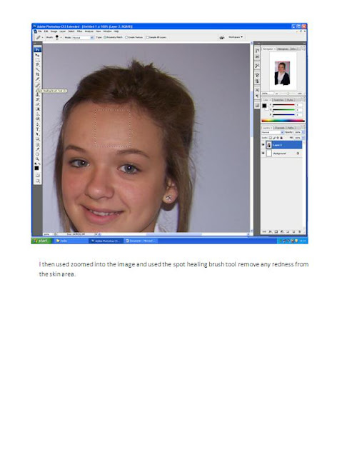
In this lesson i was asked to use Adobe Photoshop to produce the final images that i will be using in my school magazine. The screen shoots below so how i have used Photoshop to show tha tools that i have used to manipulat my images ;


Photographs for school magazine
For this lesson i was asked to take my pictures that were to feature in my school magazine .These are as soon below:


Subscribe to:
Posts (Atom)