
Wednesday, 29 September 2010
Rough layout of content page
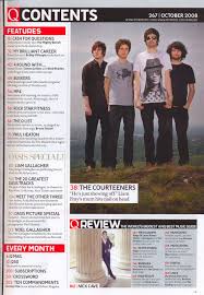
In this lesson i was asked to produce a rough sketch of my magazine content page. As shown below;

Plan of my content page
In this lesson i was asked to plan my content page i was asked to plan things such as. A list of regular content which will appear in my magazine. I added ;
The next thing i was asked to plan was a list of 10 feature articles which will appear in my school magazine these are as follows;
I will also be using a picture of the students around school or doing work.
The last image i will use will be if the students from last years prom.
- Editors letter- This welcomes new and old readers to the magazine and lets them know what the magazine is about
- School shop - This is where students can shop online to buy things such as books and pens. There is a girls and a boys selection.
- Student of the week- Each week a different student from each year group is made student of the week. They get this for going good things.
- Teacher of the week - Students voted for who they think the teacher of the week is and why.
- Find out what the students are up to- Tells other students of events that happened etc.
- Best picture of the week- Students take there pictures and send them in then another group of students then decide which is the best.
- Is there something you want..- This this were students can text in and say what they want to see in the magazine.
The next thing i was asked to plan was a list of 10 feature articles which will appear in my school magazine these are as follows;
- Beauty and the Beast cast revealed - students find out the cast of the show.
- Beauty and the Beast behind the scenes- a inside look to how the show runs.
- Beauty and the Beast dates revealed- students are told the dates of the play.
- Beauty and the Beast interview with the costume designer- a behind the look at how the costumes are made.
- Sixth form prom dates revealed.
- What are the teachers up to - This tells the students what the teachers of the school are going to be doing/ or have done.
- Painters week- pictures are a article on painters week by the students.
- New online books- Students can now read a selected of books online for free.
- Meet the people behind 'learning'- Interviews and pictures with the people who make the magazine.
- Interview with the head- A one of interview with the head teacher.
I will also be using a picture of the students around school or doing work.
The last image i will use will be if the students from last years prom.
Rough layout of front cover
In this lesson i was asked to produce a rough sketch of my magazine front cover.
As shown below
As shown below

Plan for my front cover
In this lesson i was asked to the first part i was asked to plan was the title for my magazine. I called it 'Learning ' I did this because the genre of the magazine was school. The mise-en-scene on my front cover consits of ;
- A median close up image on the front cover. On mine i have a school girl smiling.
- I have chosen a white back ground. I had done this so my image and text stand out.
- My title is in a red colour it is bold and in a bigger font so it stands out also.
- My other text is in a black colour.
- I haven't used any props as i just wanted the image alone.
Sunday, 26 September 2010
Codes and conventions of a contents cover
In this lesson i was asked to list the codes and conventions of a magazine contents cover. These are as follows :
- Colour scheme- this runs though out the magazine. It is three to four colours so therefore it is basic but eye-cacthing.
- Image- There is one main image this anchors with the cover story. Their is normally also ten small images that also anchors with the featured stories. Also the page number is on the image so that the reader knows what they relate to.
- Title- The main title is always called 'content' or 'contents'. It is not always on the left but is in a big font that differs from the other text.
- Layout- The layout is normally in two to three columns. It normally has twenty features or regular articles. It is in font 11. There is also a section for the editors letter.There is also a line gap between each section so it is clearer to the readers.
- Font- The font is in size 11 and the same thought so it is easy on the eye for the reader.
- Editors letter- This is a iintroduction as to what the magazine is about.
- Credits- This thanks the photographer i.e. for the main image on the front cover.
- Contacted details- These are normally things such as website, email, address and phone number. These are normally on the bottom right as they are the least important thing within the contents.
- Date- On the bottom or top of the page.
- Page number- this is to the left before the text and is in a different colour so is easy to see.
Tuesday, 21 September 2010
codes and conventions of a magazine frontcover
In my first two lessons i was asking to write up the codes and conventions of a magazine front cover.
These are as flows :
- Mast Head ; This is overwise known as the title, it is in a unqiue front as it then stands out. If the magazine is well known that sometimes the mat head can sometimes be partly hidden by an image, it then normally has a posing statment above it or below.
- Bar code; This is normally placed at the bottom or the size of the front cover. On the bar code it should have the price so that the customer knowns how much it is, the data so the customer knowns then the magazine was released , then the issuse number so that the customer can see when the magazine was released and therefore if they miss an issue they can then order it thought the issue number. And the last thing on the bar code is the website.
- Buzz words; These advertise to the customer if anything is new or excusive within the magazine.
- Puffs; This advertises to the customer freebies.
- Image; This is the central picture on the magazine, this is normally a close up shot. It is normally on a pain background so the image stands out. Text is normally around the image and never on the face . The picture anchers with the text written as this makes it look formal.
- Cover lines; This are around the image and are in the same font. There is normally five too six cover lines.
- Smaller pictures; These are to show what else is in the magazine .i.e. a new C.D.
- Main cover line; This goes with the main image used on the magazine to cover the maon text.
- Colour scheme; Normally three too four colours are used, by doing this it means that its simple and that the colours do not clash. The colours not only have to be eye cacthing but they also have to be easy on the eye.
- Genre; The genre of the magazine has to be made clear i.e. rock magazine.

Subscribe to:
Posts (Atom)